I would like to suggest we consider changing our official color, currently we use blue which is associated with LNP, ideologically we are closer to Greens (Green) and ALP (Red).
My suggestion would be orange, looking at a color wheel, Orange is between red and green (whos voters we want to attract) and opposite to Blue.
It should probably be defined as a specific hex code to make it consistent everywhere.
There was suggestion in the Pirate Party renaming thread for it to be purple, but in any case, it probably should be considered separately.
I think the branding is very important and should draw from the international legacy of the pirate movement. We should own our brand and not be driven by what current political players use by their positioning on a political spectrum (which I would argue the Pirate Party by its nature likely breaks anyway).
That said, there should be some room for localisation for Australia.
Ultimately this is closely tied to the ongoing discussion for identity and name of the Party.
Personally, I was quite surprised to find our Party not using purple or orange when I joined. At the time there were no other political parties with those colours that we were likely to be confused with (or could be considered serious parties). Since then the progressive parties (https://www.australianprogressives.org.au/) have adopted that colour spectrum. Orange would clash with GetUp a little.
It needs to be considered that our existing T-shirts & stickers & merch & banners etc will become outdated as a consequence of a colour change and will take time / money to replace.
Given all that, I think I’d be supportive of a primary colour change / refresh / renewal. The blue has had its time and has always felt to me like a missed opportunity to differentiate.
Speaking of differentiation, one thing I discovered when handing out HTVs last election is that if I happened to be standing next to a LNP HTV hander-outer-er, people would tend to not bother taking my flyers, presumably because they’d already picked up a blue flyer from the person next to me.
I like the blue. It feels different enough to the Liberal Party’s darker blue that confusion should be abated if we stand further away from them at future elections.
Píratar in Iceland is black and purple, and I feel like they’re the guys that we should be emulating, given their success in the Alþingi (and the fact that it came from voter disenfranchisement, which we also stand to make a lot of votes from). Black is sort of a menacing colour, so maybe we’re better off using purple (which also makes better design sense; it’s very hard to use black as a highlight colour on websites and such), especially given the imminent name change.
And as others have said, orange is often used to denote more hardcore libertarians, although the UK Lib Dems (who we have a lot in common with) use amber, which is a nice colour and currently unused in Australian politics as far as I know.
i originally thought that ‘doh, progressives took purple’ … but with thier recent history and results i suspect they are a soon to become non-entity?
I didnt have too much trouble at my polling place with the blue, but i was very vocal about PIRATE PARTY!
Whereas the guy locally who did a few days prepolll complained everyone thought he was handing out for liberal (and he had the tapebones ppau shirt on)
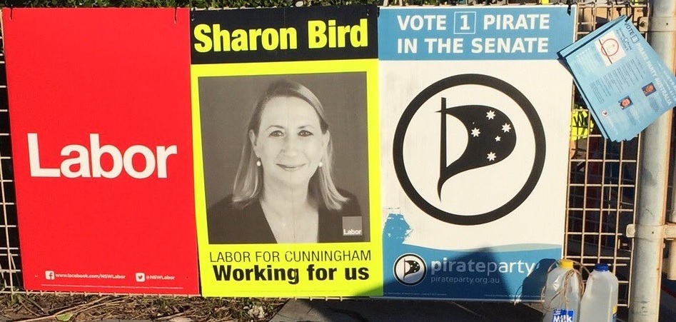
I think if we keep the light blue we should try paring it with black instead of white. There’s not much contrast in white on light blue and it’s difficult to read from distance. See the HTV in the photo and compare our corflute to the yellow on black. There’s a big difference in readability when you’re driving past.
If we do change I’m a fan of the fluoro on black. High vis orange for the working class.
A colour scheme based on xwindows would be kinda appropriate imo. Old school web browser colours, from back when there was like 16 to choose from maybe…